
HTML email guide: how to shine in every inbox.
Newsletters, campaigns, and approved emails all break the same way. Here's why email rendering is its own discipline, and how to keep your design intact from Apple Mail to Outlook.

Plain text vs HTML email: is the extra work worth it?
A plain-text email is the safest thing you can send. It renders the same everywhere, it never breaks, and it lands in the inbox without a fight. The trouble is that it can't do much. There's no logo, no brand colour, no button that looks like a button, no way to guide the reader's eye to the one thing you want them to click. A monthly newsletter, a product launch, a webinar invite, or an approved email a rep sends to a physician all rely on hierarchy and design to work. Plain text flattens every message into the same grey paragraph.
HTML email is how you get the brand back: a proper header, columns, imagery, styled calls to action, and the tracking that tells you whether any of it landed. The catch is that an email client is not a web browser, and building for it feels like stepping back fifteen years. The techniques that make a modern website work will often fall apart the moment the same code arrives in Outlook. Teams underestimate this, so it's worth understanding what you're up against before you brief a designer or approve a template.
There's no single email renderer
Web pages have effectively three browser engines to worry about, and they mostly agree. Email has dozens of clients, each parsing your HTML its own way. The one that causes the most grief, Outlook on Windows, renders email using Microsoft Word's engine rather than a browser. Word was never built to lay out a web page, and it shows.
Email clients aren't browsers: why rendering is its own discipline
When you load a website, a browser like Chrome, Safari, or Firefox interprets your page and its styling. Those engines are modern and reasonably consistent. Email works nothing like that. Your message is opened inside whatever client the reader happens to use, and each one has its own rules about which parts of your design it will honour, which it will rewrite, and which it will throw away.
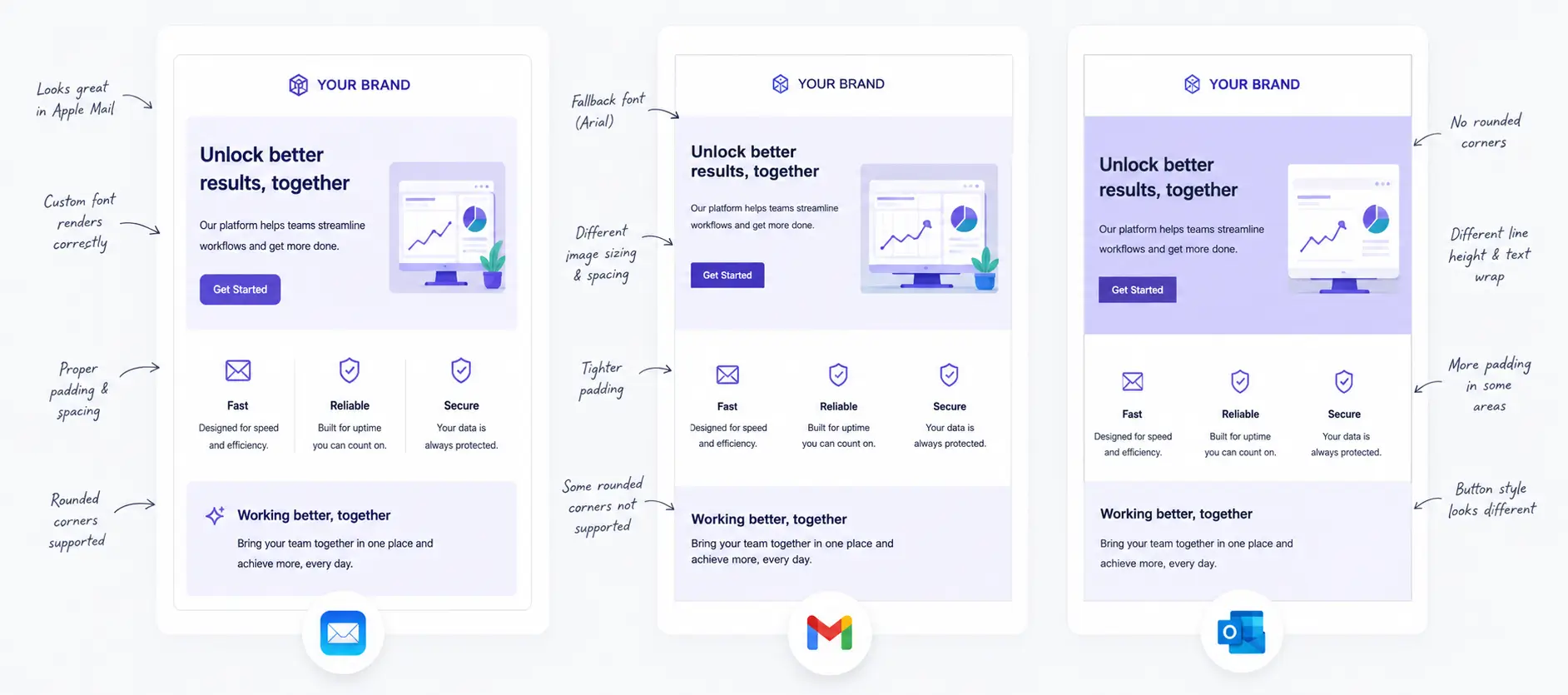
The worst part isn't any single quirk, it's that no two clients render your email quite the same way. Fix a layout so it looks right in Outlook and you can break it in Gmail; nudge the spacing for Gmail and Apple Mail shifts. A lot of the work is this back-and-forth, getting one client right without knocking another out of place, which is why a careful build aims for the common ground all of them handle rather than chasing each one separately.
Three behaviours cause most of the pain:
- Outlook is several different apps, and more than one is a pain. The classic Outlook for Windows, still in wide use across Microsoft 365, lays out email with the same engine that powers Word documents. It ignores modern layout, mishandles spacing, and won't show background images without a Microsoft-specific workaround. The newer Outlook and Outlook on the web render more like a browser, but they bring their own quirks and strip some of your styling, so getting one Outlook right doesn't mean the rest follow.
- Gmail clips long messages. Once the raw HTML of a single message passes roughly 102KB, Gmail hides the rest behind a "View entire message" link. Everything below the cut, including your unsubscribe footer, disappears from the default view.
- Clients strip and rewrite your styling. Several webmail clients remove or rename styling you group together at the top of the email, so anything not applied directly onto each element can vanish. This is why email has stayed with styles written inline, right on each element, long after the web moved on. Even that isn't a guarantee: support for individual styles is uneven, and a handful of clients and corporate security gateways strip or rewrite them wherever they live. Rounded corners are the classic example. Even set directly on the element, they still square off in the classic Outlook for Windows, so a rounded button has to look right as a rectangle too.
None of this is a reason to avoid HTML email. It's the reason email is built differently from a web page, using tables for layout and inline styles for nearly everything, then tested against the specific clients your audience opens. Because inline styles can still be dropped or reinterpreted, the sturdiest builds back the critical parts with old-fashioned HTML layout settings: background colours, widths, and alignment set directly on the table and its cells rather than in the styling. A client that ignores your styles will usually still honour those, so the layout and key colours survive even when the styling doesn't.
The most common HTML email problems (and how to fix them)
After building and troubleshooting a lot of these, we see the same handful of problems account for most of what goes wrong. Each one below has a clear cause and a fix that holds up.
Layout collapses in Outlook
If you lay the email out the way you'd build a web page, the classic Outlook for Windows will stack or scramble it, because its Word engine doesn't support the modern layout techniques a browser does. Build the structure with nested HTML tables instead. It feels dated, but a table-based layout is the one thing every client agrees on. For multi-column sections that need to line up in Outlook specifically, wrap them in a conditional "ghost table" that only Outlook reads.
Padding and spacing go missing
Outlook is unreliable about the spacing around ordinary text and content blocks, so gaps you designed carefully can collapse to nothing. Put your spacing on the table cells themselves, and use empty spacer rows with a set height where you need vertical breathing room. Any spacing applied the way a web page would is a suggestion Outlook is free to ignore.
Structure and doubled-up spacing
Two related traps come from the same instinct. Structuring the email with generic content blocks, the way you would a web page, brings back the layout problems above, since Outlook won't handle them the way a browser does. The structure belongs in table cells. The second is doubled spacing. Once spacing lives in more than one place, say a padded table cell wrapping a block that also carries its own spacing, or a cell sitting next to text with its own built-in gap, the space stacks differently from one client to the next: a tidy gap in Apple Mail becomes a much larger one somewhere else. Keep spacing in a single, predictable place on the cell, and clear the built-in spacing that text and headings come with by default, so nothing adds space you didn't ask for.
Custom fonts fall back to Arial
Web fonts only load in a few clients, mostly Apple Mail and some versions of Outlook.com. Gmail and desktop Outlook ignore them entirely and drop to a default. Specify a full font stack that ends in a safe web-standard font, and design so the email still looks right when the fallback is what most people see. Don't set body copy in a display font and assume it survives the trip.
Images are blocked or missing
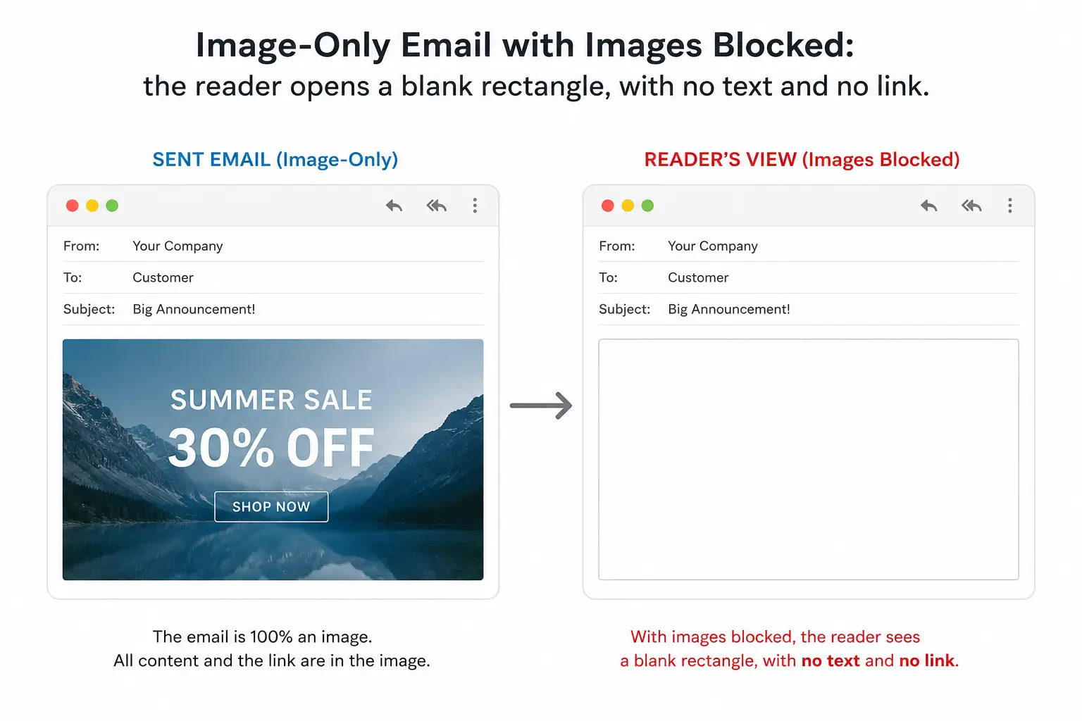
Many clients hide images until the reader clicks "show images," and some block them by default the first time a sender writes. If your message is one big image, a blocked inbox sees a blank rectangle. Keep the important words as real text, write meaningful alt text on every image, and give image cells a background colour so the layout still reads before anything loads. Never bury your headline, offer, or safety information inside a graphic.
Dark mode changes your colours
Apple Mail, Outlook, and Gmail each handle dark mode differently. Some leave your email alone, some invert light backgrounds, and some recolour text in ways that can turn a black logo invisible on a dark background. Test in dark mode, avoid pure black or pure white where a partial inversion would hurt, and add a transparent or light-padded background around dark logos so they survive. Where a client supports it, you can serve a dark-mode-specific version, but don't rely on that alone.
Gmail clips the bottom off
The 102KB clipping limit is about the size of the email's code, not the images. Bloated, repetitive code and long tracking URLs add up faster than people expect. Keep the code lean, avoid pasting in unnecessary comments and spacing, and put the message that matters near the top. If you're regularly near the limit, that's usually a sign the template is carrying more code than it needs.
Why not just make the whole email one big image?
It's a fair question, and it's the shortcut a lot of people reach for. Design the email as a single graphic, slice it into one image, and it looks pixel-perfect everywhere with none of the table wrangling above. The problem is that it trades every rendering headache for worse ones.
- Blocked images leave a blank email. Plenty of clients hide images until the reader allows them, and some block them by default for a first-time sender. If the whole message is one image, that reader opens an empty rectangle with nothing to read and nothing to click.
- There's no real text. Screen readers get only your alt text, dark mode can't adapt colours it can't see, and nobody can select or copy anything. An image-only email is close to invisible to anyone using assistive technology.
- Spam filters don't like it. A high image-to-text ratio is a long-standing spam signal, and an email with no real text gives filters little to weigh beyond the picture. Image-only sends are more likely to land in the junk folder.
- It reads badly on phones. A fixed-width image built for desktop scales down on a phone until the text inside it is too small, or it forces sideways scrolling. Text baked into a graphic can't reflow the way real text does.
- Every change means a re-export. Fixing a typo, swapping a price, or repointing a link means editing the source file and exporting the image again. Links can only be mapped to regions, so you lose the simple per-word linking that real HTML gives you.
The better approach is the boring one: real, selectable text for your words and buttons, and images used for what images are genuinely good at, like photography and brand visuals, each with proper alt text and a background colour behind it. In life sciences this stops being a preference. Safety information and fair balance have to be real, accessible text a reader and a screen reader can both reach, not pixels hidden inside a JPEG.
One person, multiple devices: phone, desktop, and webmail
A recipient doesn't have one fixed way of reading your email. The same person might open it on a laptop at their desk, on a phone on the way home, and in a browser at work, and each of those shows the email differently. You rarely get to choose which one they'll use.
And a single email service isn't one thing either. Gmail on the web, the Gmail app on iOS or Android, and a Gmail account opened in Apple Mail all follow different rules. Outlook is the sharpest example, with the classic Windows app rendering through Word while Outlook on Mac, iOS, and the web use a normal browser engine and behave completely differently. So "it works in Outlook" only means something once you say which Outlook, on which device.
Three surfaces are worth picturing for every send:
- Phones, iOS and Android both. Most email is opened on a phone first, and the two platforms don't match. Apple Mail on iPhone is fairly forgiving; on Android you're dealing with the Gmail app and, on a lot of Samsung handsets, Samsung Email, each with its own quirks. Narrow screens push toward a single column, scale text up, and expand tap targets, so a two-column desktop layout has to collapse gracefully rather than shrink to an unreadable width.
- Desktop apps. Installed clients like Outlook for Windows are the strictest and least forgiving, and they're still common in corporate and life sciences environments.
- Webmail. Browser-based clients like Gmail and Outlook.com rewrite your HTML on the way in, which is where stripped styles and renamed classes bite.

Litmus
Preview one email across dozens of real clients and devices at once, with spam, link, and dark-mode checks, plus engagement analytics after the send.

Email on Acid
Client and device previews across the full matrix, with accessibility and pre-send checks that catch broken links and rendering issues before they go out.
Responsive design helps, but it isn't a given. Some clients, the classic Outlook for Windows chief among them, have no responsive support at all and ignore the rules that would resize the layout, so it can't adapt on its own. The safer habit is to build mobile-friendly by default, a single fluid column that reads well at any width, and treat the responsive behaviour as an enhancement for the clients that support it rather than the thing holding your layout together.
Light versus dark mode then sits on top of all of it. The same email, on the same phone, can look one way in light mode and another in dark, because the client may invert backgrounds or recolour text on its own. A build that was only checked in light mode on a desktop has been seen in maybe a quarter of the conditions it will meet. That combination, surface times appearance mode, is what makes previewing across real environments worth the few minutes it takes.
Email client compatibility table
This is the short version of what you can and can't count on. "Partial" means it works in some versions or with caveats, so test rather than assume. Outlook here means the classic Windows desktop app, which is the strictest of the group. On Android, the Gmail app tracks the Gmail column, while Samsung Email is looser and worth its own check.
| Feature | Apple Mail | Gmail (web & app) | Outlook (Windows) | Outlook.com / Mac |
|---|---|---|---|---|
| HTML tables for layout | Yes | Yes | Yes | Yes |
| Inline CSS | Yes | Yes | Yes | Yes |
<style> block in head |
Yes | Yes | Partial | Partial (rewritten) |
| Flexbox / grid / float | Yes | Partial | No | Partial |
| Media queries (responsive) | Yes | Partial | No | Partial |
| Web fonts | Yes | No | No | Partial |
| Background images | Yes | Partial | No (needs VML) | Partial |
| Rounded corners | Yes | Yes | No | Partial |
Padding on div elements |
Yes | Yes | Unreliable | Partial |
| Animated GIF | Yes | Yes | No (first frame only) | Yes |
Embedded <video> |
Yes | No | No | No |
| Dark mode handling | Adapts | Adapts | Varies | Adapts |
The pattern is consistent: Apple Mail is the most capable, Gmail sits in the middle, and desktop Outlook is the one that decides how conservative your build has to be. If a design works in Outlook, it works nearly everywhere.
HTML email best practices: what to do and what to avoid
| Do this | Avoid this |
|---|---|
| Build layout with nested HTML tables | Laying it out the way you'd build a web page |
| Write styles inline, backed by HTML layout settings | Relying only on styles grouped at the top of the email |
| Put spacing on table cells and spacer rows | Trusting web-page spacing to hold in Outlook |
| Keep key words as real, selectable text | Sending a single flattened image as the email |
| Use a font stack with a safe fallback | Setting body copy in a web font and hoping |
| Keep the HTML under Gmail's 102KB clip | Letting bloated, comment-heavy code pile up |
| Test on real clients before you send | Approving off a single design preview |
| Include a plain-text version alongside the HTML | Sending HTML only and hurting deliverability |
The single habit that saves the most rework is testing early. A preview in your design tool tells you what the email looks like in that tool, not in Outlook or Gmail. Rendering-preview services like Litmus and Email on Acid show your message across dozens of real clients at once, which is how you catch the Outlook break before the client does, not after the send.
Hand-coded email is still the better option, even with Mailchimp
Plenty of teams sending a newsletter or campaign never touch raw HTML, and for a simple send they don't need to. Email platforms exist to carry most of this weight for you. Mailchimp is the name most people know, but Constant Contact, Campaign Monitor, Klaviyo, HubSpot, and Brevo all do the same core job: pre-built templates that have already been tested across clients, a drag-and-drop editor, plus the sending, list management, and reporting around it.

Mailchimp
Tested, responsive templates with a drag-and-drop editor, list management, automation, and deliverability handled for you. A sensible default for most newsletters and campaigns, until you need brand control the stock templates can't reach.
A good platform handles the basics for you. Its templates are built on tables, style inline, adapt on mobile, include a plain-text version alongside the HTML, and add a compliant unsubscribe footer. But the real strength of these platforms is everything around the send rather than the editor itself: managing your lists, scheduling and automating campaigns, handling unsubscribes and bounces, and getting the email delivered to the inbox at scale. That's what you're really paying for, and for a straightforward send it may be all you need. The drag-and-drop editor is the part you'd miss least.
But every template has limits. The moment you want the email to be truly yours, matched to your brand rather than nudged toward the nearest preset, you run into the limits of the drag-and-drop editor. That's where a hand-coded email wins, even inside Mailchimp. Building the template by hand gives you real control over layout, type, spacing, and interaction, so you can get the most out of what these platforms and the email clients allow instead of settling for what the builder makes easy.
You don't have to give up the platform to get there. The strongest setup is a custom-coded template, built to every standard above and tested across clients, that plugs straight into Mailchimp or whichever tool you send from. Your marketing team keeps the familiar editor, list management, and reporting, while the design and the tricky cross-client rendering are handled properly underneath. The one thing to remember is that custom work still follows the rules: the moment you hand-code, you own the Outlook quirks and the testing that go with them.
Life sciences email is even less forgiving
Everything above applies to a regular newsletter or campaign. In pharma, biotech, and medical device work, the email also has to satisfy the platform it's sent from and the review it has to pass. Veeva Approved Email and IQVIA OCE Email don't let a rep send whatever they like. Messages are assembled from pre-approved templates and content fragments, with tokens that personalise the email at send time, and the whole thing still has to clear medical, legal, and regulatory review before anyone uses it.
That adds constraints a marketing email never faces. Content is modular, so a fragment has to render correctly on its own and in combination with others. Tokens have to degrade gracefully when a value is missing. Required elements like fair balance, safety information, and unsubscribe handling have to be present and correct every time, which is exactly the content Gmail clipping or a blocked image would hide if the build is careless. In Canada there's PAAB review to account for, plus bilingual English and French versions that both have to render the same way. A template that looks fine in one language can break when the longer translation reflows.
So a life sciences email has to solve two problems at once: rendering across clients, and clearing regulated review. We build for both: Veeva Approved Email and IQVIA OCE Email, tested across the clients your field team's audience uses and packaged to pass review.
Sources & Further Reading
HTML email gives a newsletter or campaign the brand and hierarchy that plain text can't, but email clients aren't browsers, and Outlook on Windows still renders with Word. Build with tables, write styles inline, keep key content as real text, stay under Gmail's clip limit, and test on real clients before you send. In life sciences, the same email also has to work inside Veeva or OCE and pass review. When it needs to render right and clear MLR, send us what you have.
We've been building professional email for over 20 years: marketing campaigns, newsletters, contact-form notifications, and approved emails for regulated teams, all across every major client and platform. That's where this guide comes from.