Veeva CLM detail aids for a field team
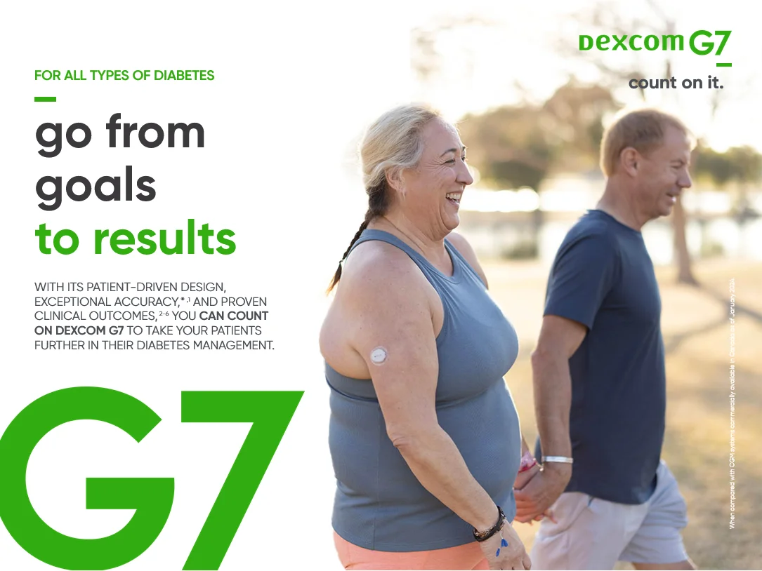
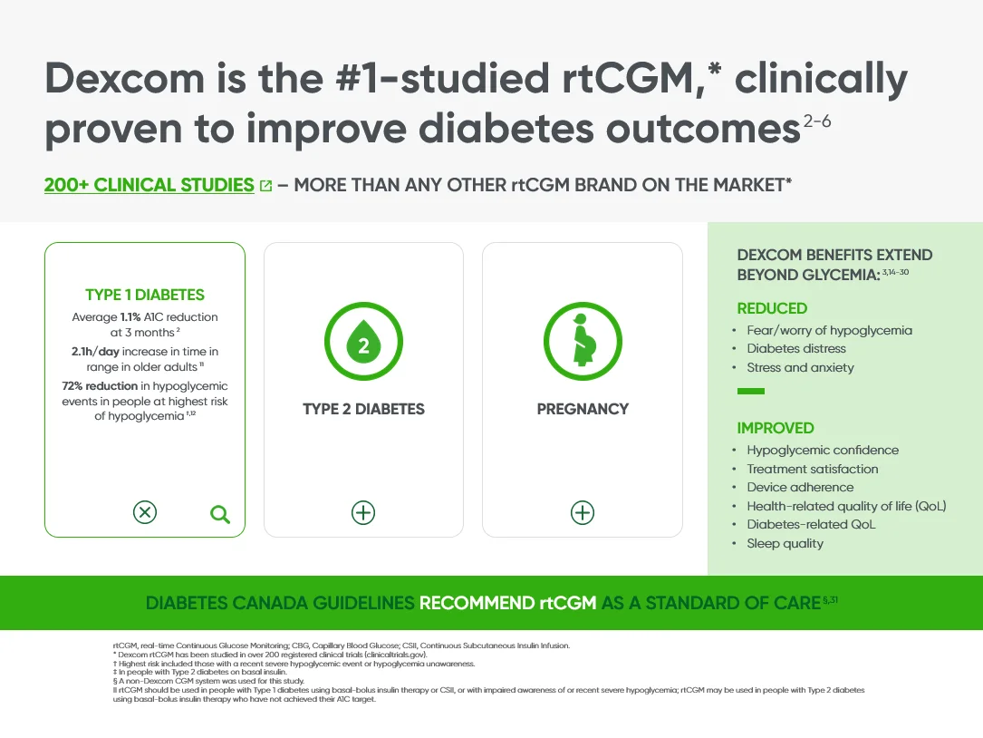
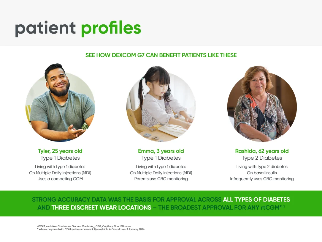
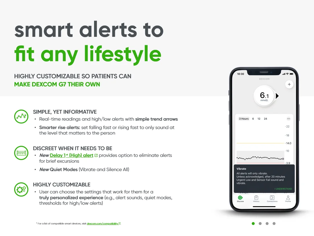
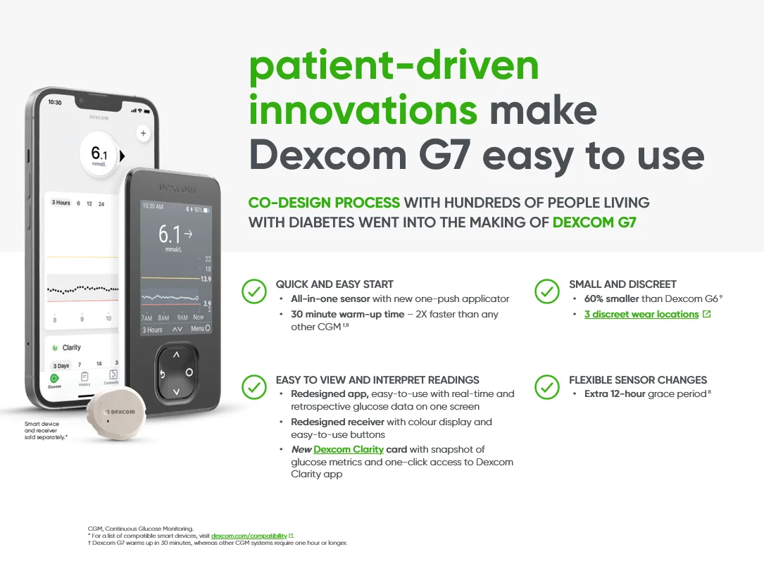
An ongoing engagement turning the materials Dexcom produces into interactive Veeva and IQVIA CLM detail aids for their field team, a couple hundred presentations to date, in English and French, designed for clear conversations with healthcare professionals and reliable use in the field.
The challenge: a CLM that works in the room
A detail aid only earns its place if a rep can use it during a real conversation. The content had to be quick to navigate, so a rep could jump to the right message based on the question in front of them, hold up on the devices the team carries, keep working when the connection didn't, and pass MLR review without a round of rework.
What we built: field-ready Veeva CLM
We designed and built the Veeva CLM presentations around how the field team talks about the product. Navigation was structured so reps could move between sections without walking through every slide, animation and interactive elements were used where they helped the conversation rather than for their own sake, and the build was tested for offline use across devices. Content was tagged for analytics and delivered as MLR-ready, Veeva-ready packaging, with clean source files and annotations for future updates.
Working across platforms? The same team also builds IQVIA OCE Personal CLM.
Veeva CLM Build
- Veeva CLM
- HTML5
- Interactive Detail Aid
- MLR-Ready Packaging
- Field Deployment
What we build into a CLM
Across a couple hundred interactive Veeva and IQVIA CLM detail aids for Dexcom, in English and French, we handled the build end to end, from design to MLR-ready packaging. The same standards carry across both platforms.
IQVIA to Veeva migration
When Dexcom moved from IQVIA OCE to Veeva CRM, we converted roughly 30 to 40 detail aids across, keeping the content and interactivity intact.
PDF and PowerPoint to Veeva CLM
Static PDF and PowerPoint decks rebuilt as interactive CLM, so existing content becomes something a rep can move through.
Bilingual Veeva CLM, English and French
Every presentation delivered in both official languages for the Canadian field, built so the two versions stay in step.
Custom CLM navigation (tap to navigate)
Every deck replaces the platform's built-in navigation with Dexcom's preferred tap gestures and interactive reveals. Longer presentations get a custom menu for jumping straight to a section.
HTML5 animation and rich media
Purposeful motion, plus video and other rich media, embedded and tuned to play reliably on device.
Adaptive across iPad models
Layouts that hold their proportions across the range of iPad screens a field team carries.
Offline-ready detail aids
Everything works with no connection, so a detail holds up in a clinic with poor signal.
Interactive popups and expandable detail
Interactive popups surface quick reference on the spot, and tapping a section expands extra detail in place, so a deck stays clean but the depth is there when the conversation calls for it.
Matching Veeva approved emails
Most CLMs came with a matching approved email, so the field and the inbox told the same story across the campaign.
What made CLM builds hard
Every Veeva CLM detail aid ran into the same design and engineering problems, and each deck had to solve them.
From static PDF to interactive CLM
PDF and PowerPoint decks were built for paper and projectors, not an iPad. Every layout had to be rethought for a screen a rep holds and taps.
Designing for the iPad screen
An iPad screen gives you far less space than a printed page or a monitor, so each screen had to earn its content and stay readable at arm's length.
Consistent across iPad models
The field team carries a range of iPad sizes and generations, so layouts had to hold their proportions and stay sharp across all of them.
JavaScript animation and interactivity
Charts that build, elements that reveal on tap, and other interactive moments were coded in JavaScript and tuned to run smoothly on device.
Replacing the default CLM navigation
Veeva's built-in slide navigation was replaced with the custom tap gestures the field team preferred, so moving through a deck felt natural in a live conversation.
Reusable CLM components
Shared, reusable components kept typography, spacing, and behavior consistent from slide to slide and across every presentation in the set.
Brand and design compliance
Every deck had to sit inside tight brand guidelines, down to color, type, and spacing, with no drift across a large set of presentations.
Fast MLR revision turnaround
When medical review sent back changes, they had to be made and repackaged quickly, without breaking the build or the layout.
Adapting English CLM to French
French copy runs longer than English on average, so each bilingual deck had to flex to fit more text without redrawing every screen.